


Site Design
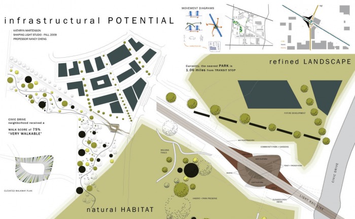
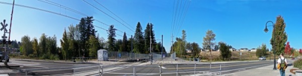
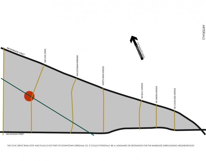
The crux of my project relied heavily on site and the existing context. With the City Hall Max stop only a quarter of a mile away and new development along the intersection of Civic Drive and the Max line, I wanted this stop to not only impart the infrastructure of a waiting area, but also embody a gathering of community.
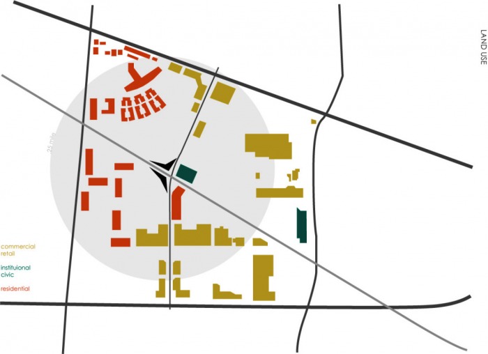
The distinctive wooded site to the south of the Max line provided a natural landscape that I treated as an amenity for the community, but also an opportunity to retain and engage local habitat in the developing neighborhood.
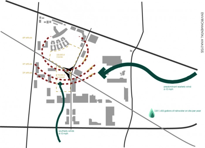
The nearest park to this Civic Drive neighborhood is 1.06 miles away and while this community is rated 75% “very walkable,” it is still heavily dominated by auto traffic.
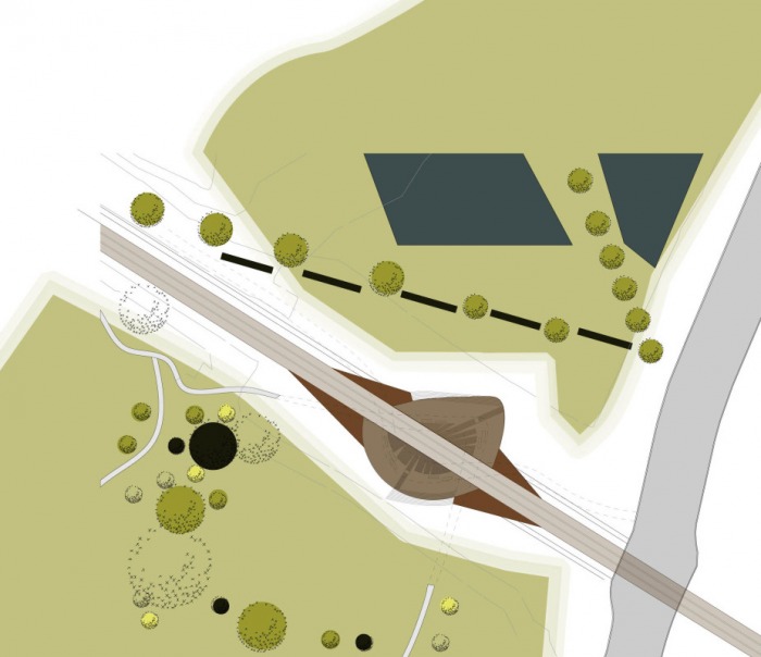
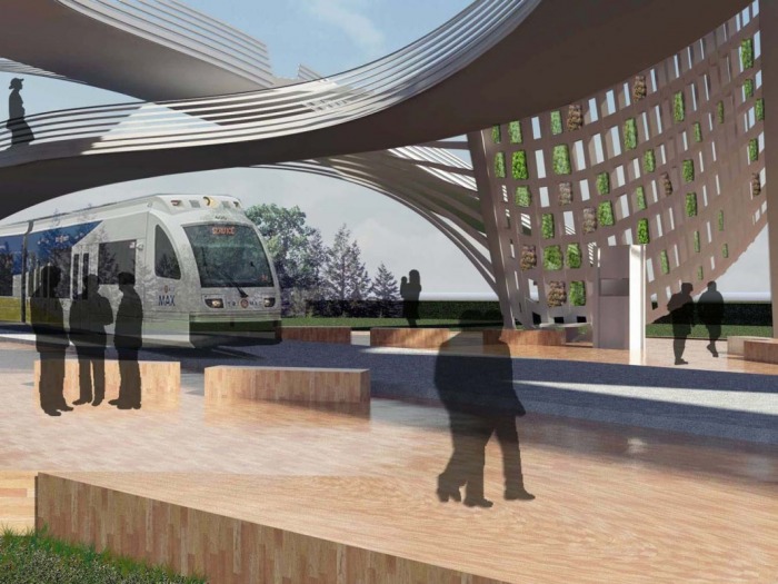
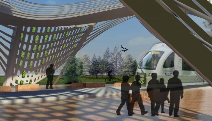
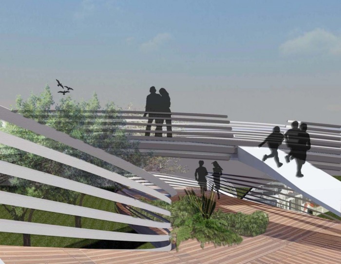
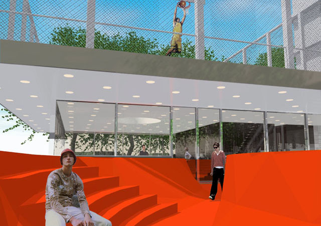
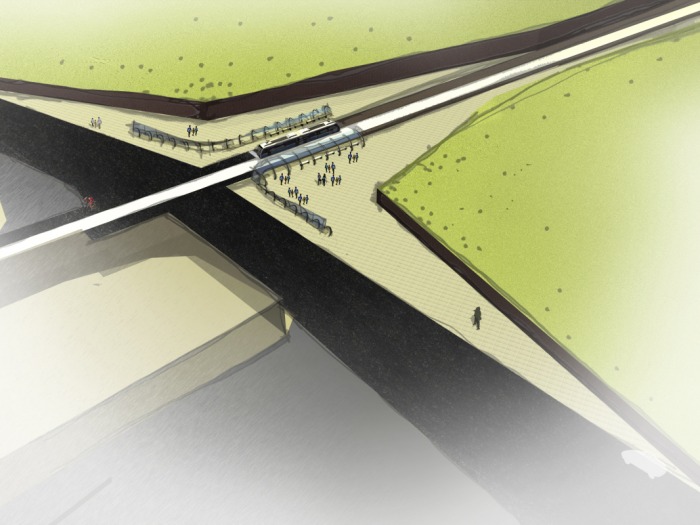
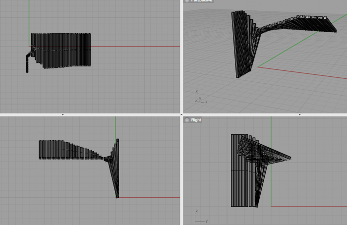
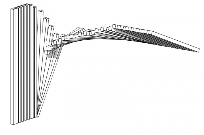
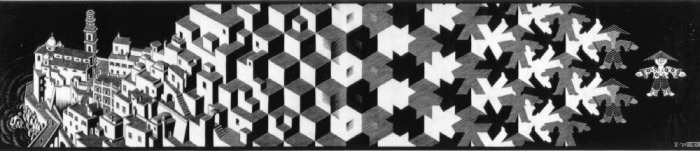
In desiring to foster a relationship between both sides of the tracks, I designed two looping structures that hold the two divergent ecologies on either side, to the north, a formal park space and to the south, a natural habitat area.
Each form holds to their corresponding environment; the tighter curve to the south clutches the natural habitat and walking paths; while the more open curve to the north is a slower-paced move connecting to the Max path destined for Portland. Together these woven structures meet above the transit stop for a brief opening and opportunity to switch paths.
Users
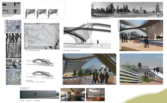
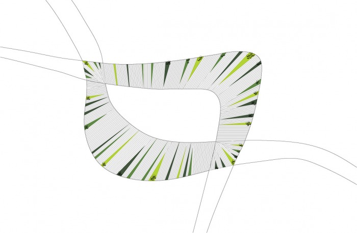
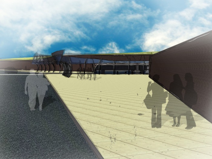
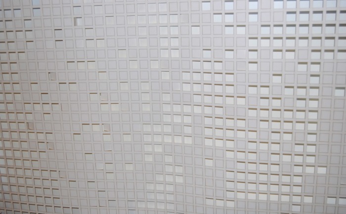
The design provides accessibility on multiple levels, waiting areas for the train, a means to travel through the neighborhood, and the integration of habitat for local species. The grid-structure of the intersecting forms provides a light and open environment for the users and the various functions of this design generate more activity on the site providing a safe environment.
Seasonal changes in the landscape will affect the visual character and animal species of the station. Seasonal and local plantings will be integrated throughout the platforms and the latticed shelters.
Material Assemblies
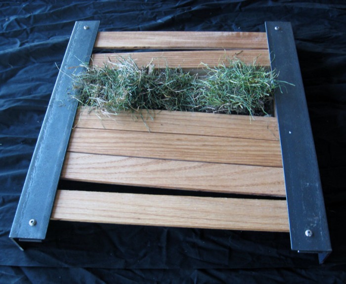
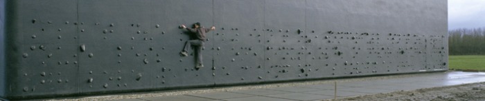
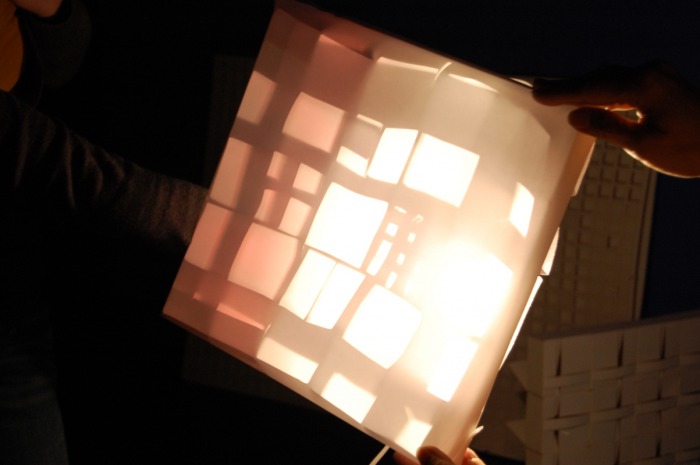
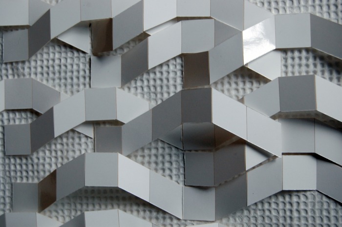
Initially, I had envisioned the structure composition to be concrete. Upon further investigation and discussion, I changed it to a steel structure together with wood slat platforms. I created the wood and steel structure for the mock-up including real grass to embody the green slits throughout.
While the design and aesthetic are appealing to me in it’s own right, I made a mistake switching the original concept of the structure. The idea is to encourage and capture the movement of the train and that of the pedestrian and the fluid nature of the form lends more to concrete than to steel. My hesitation with concrete came at the mid-review when a concern about a “pedestrian freeway” was raised. In the end, I should have chosen the material I had initially imagined, but it was the material study that led me to this conclusion and without it, I’m not sure I would have come to this realization.
Sustainability
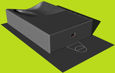
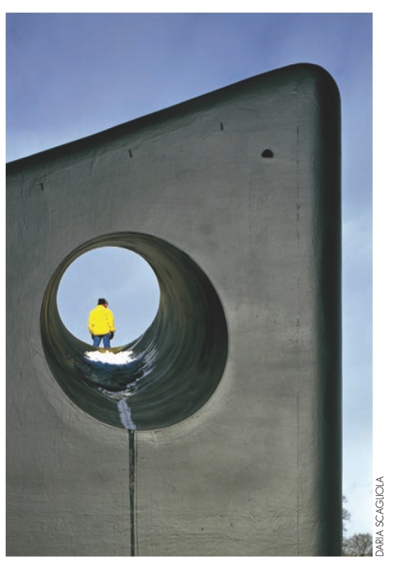
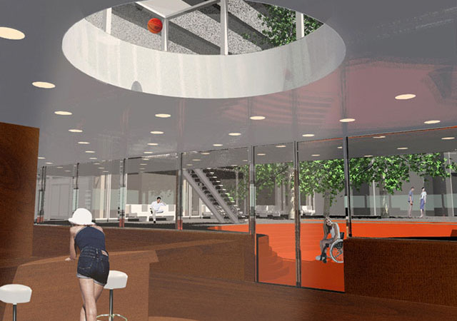
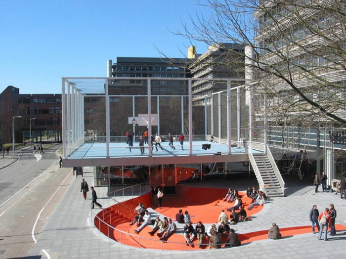
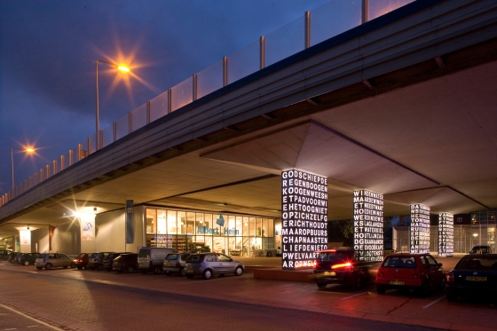
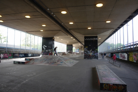
I took on a broader view on sustainability for this project. My case study of the projects from NL Architects exhibits this idea of multi-functionality. To invest money into a built project, especially in today’s economy and in our consume/throw away culture, the idea of encompassing multiple functions within a single project is necessary to reduce our impact on the earth.
Adding the plantings within the structure also attest to the sustainability at a smaller scale. The green introduces impervious surface for rainwater run-off, a natural filter for sunlight and habitat for local species.
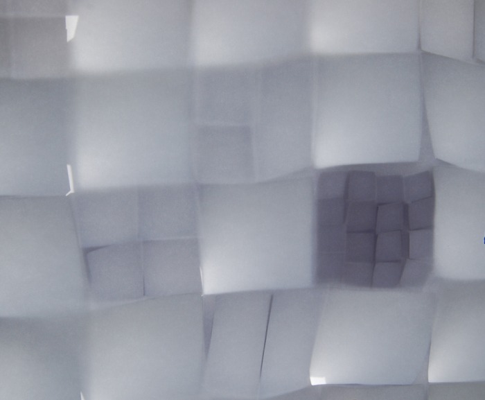
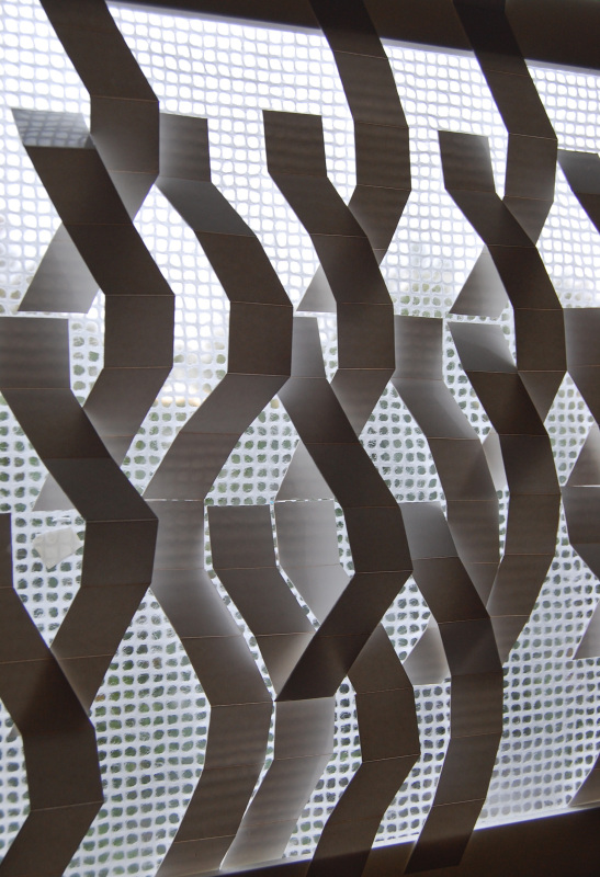
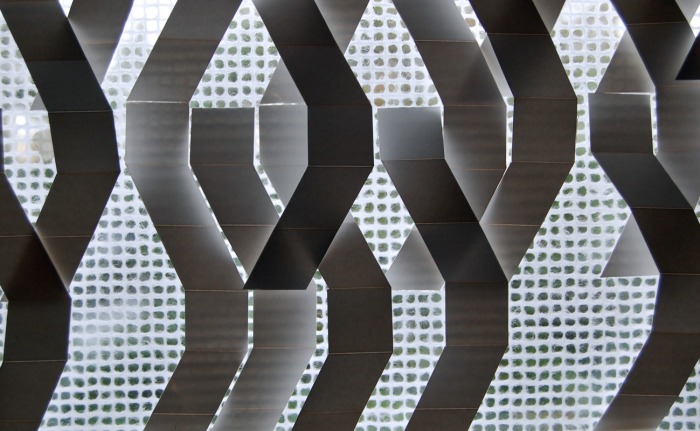
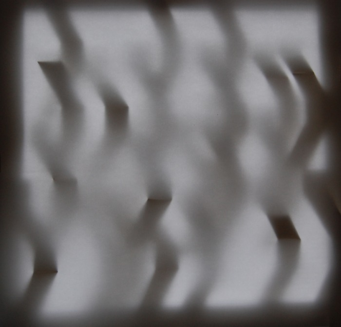
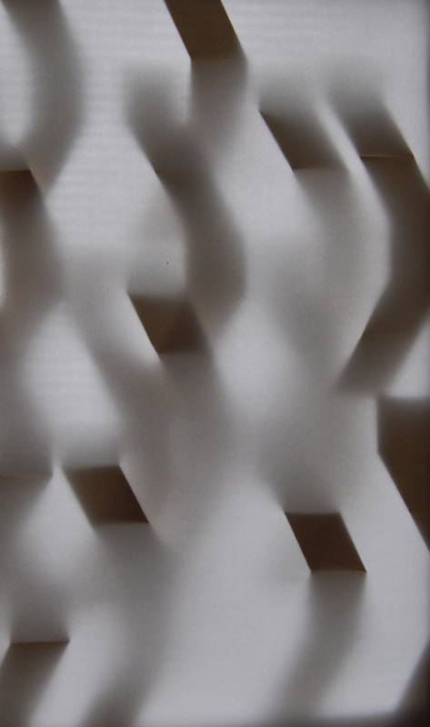
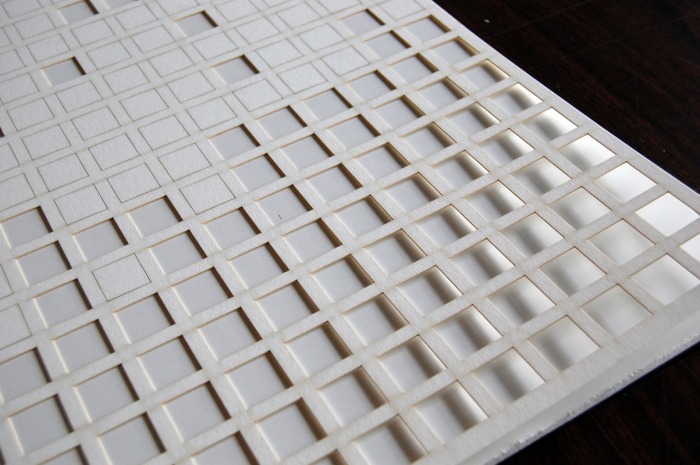
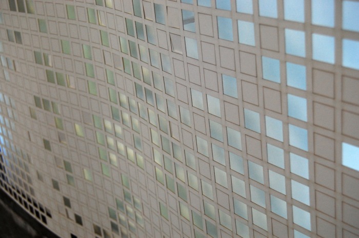
Light & Shadow
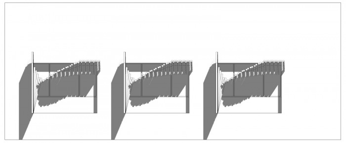
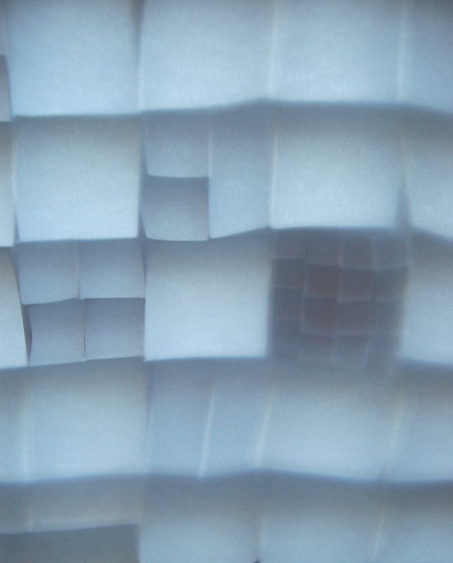
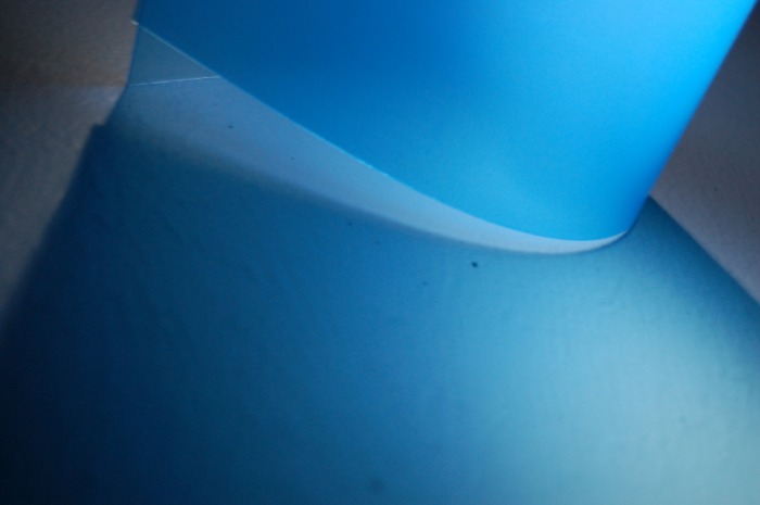
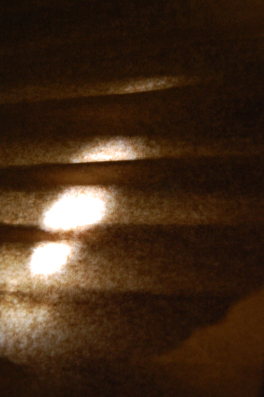
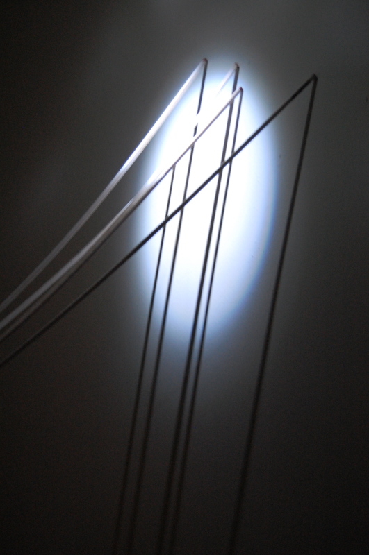
My initial light studies of creating a grid and layering various scales within that structure have influenced this final light study. The latticework of the bisecting forms creates a multiple windows for the light to filter and the changing nature of the form alters the aperture size, ultimately enhancing the dynamic light quality. The green wall woven into this grid structure also produces a new effect of changing patterns and colors based on planting type and time of year.
What I learned…
What I will most take away from this class is learning a new program, which will be valuable in my design process in the future. I was excited to take on Rhino, but found what a complex program it really is. While I struggled quite a bit, the scale of the project made it manageable and I will be able to tackle something larger next time.
I also learned the advantage of distilling down to one primary goal and to not be sidetracked by other influences. While difficult to do throughout a nine-week process with multiple projects, I think it allows for the most successful end result.
The crux of my project relied heavily on site and the existing context. With the City Hall Max stop only a quarter of a mile away and new development along the intersection of Civic Drive and the Max line, I wanted this stop to not only impart the infrastructure of a waiting area, but also embody a gathering of community.
The distinctive wooded site to the south of the Max line provided a natural landscape that I treated as an amenity for the community, but also an opportunity to retain and engage local habitat in the developing neighborhood.
The nearest park to this Civic Drive neighborhood is 1.06 miles away and while this community is rated 75% “very walkable,” it is still heavily dominated by auto traffic.
In desiring to foster a relationship between both sides of the tracks, I designed two looping structures that hold the two divergent ecologies on either side, to the north, a formal park space and to the south, a natural habitat area.
Each form holds to their corresponding environment; the tighter curve to the south clutches the natural habitat and walking paths; while the more open curve to the north is a slower-paced move connecting to the Max path destined for Portland. Together these woven structures meet above the transit stop for a brief opening and opportunity to switch paths.
Users
The design provides accessibility on multiple levels, waiting areas for the train, a means to travel through the neighborhood, and the integration of habitat for local species. The grid-structure of the intersecting forms provides a light and open environment for the users and the various functions of this design generate more activity on the site providing a safe environment.
Seasonal changes in the landscape will affect the visual character and animal species of the station. Seasonal and local plantings will be integrated throughout the platforms and the latticed shelters.
Material Assemblies
Initially, I had envisioned the structure composition to be concrete. Upon further investigation and discussion, I changed it to a steel structure together with wood slat platforms. I created the wood and steel structure for the mock-up including real grass to embody the green slits throughout.
While the design and aesthetic are appealing to me in it’s own right, I made a mistake switching the original concept of the structure. The idea is to encourage and capture the movement of the train and that of the pedestrian and the fluid nature of the form lends more to concrete than to steel. My hesitation with concrete came at the mid-review when a concern about a “pedestrian freeway” was raised. In the end, I should have chosen the material I had initially imagined, but it was the material study that led me to this conclusion and without it, I’m not sure I would have come to this realization.
Sustainability
I took on a broader view on sustainability for this project. My case study of the projects from NL Architects exhibits this idea of multi-functionality. To invest money into a built project, especially in today’s economy and in our consume/throw away culture, the idea of encompassing multiple functions within a single project is necessary to reduce our impact on the earth.
Adding the plantings within the structure also attest to the sustainability at a smaller scale. The green introduces impervious surface for rainwater run-off, a natural filter for sunlight and habitat for local species.
Light & Shadow
My initial light studies of creating a grid and layering various scales within that structure have influenced this final light study. The latticework of the bisecting forms creates a multiple windows for the light to filter and the changing nature of the form alters the aperture size, ultimately enhancing the dynamic light quality. The green wall woven into this grid structure also produces a new effect of changing patterns and colors based on planting type and time of year.
What I learned…
What I will most take away from this class is learning a new program, which will be valuable in my design process in the future. I was excited to take on Rhino, but found what a complex program it really is. While I struggled quite a bit, the scale of the project made it manageable and I will be able to tackle something larger next time.
I also learned the advantage of distilling down to one primary goal and to not be sidetracked by other influences. While difficult to do throughout a nine-week process with multiple projects, I think it allows for the most successful end result.


 RSS Feed