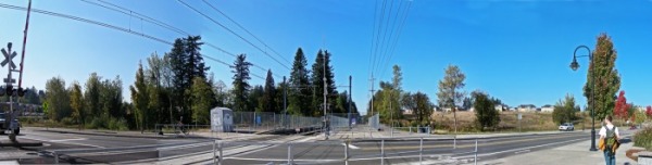
panorama of civic drive stop
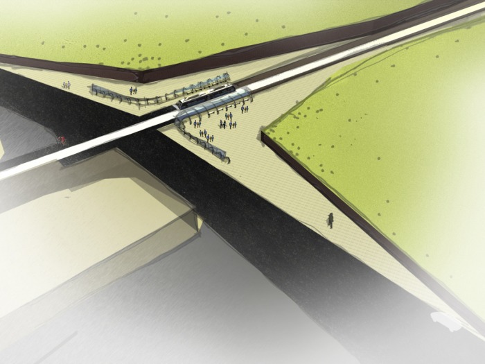
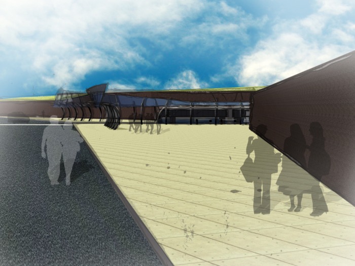
Tony, Kate and I worked together this past week to develop a conceptual site design. Initially, when we first shared our impressions of the site, we had similar thoughts about our experience. The natural landscape gave us a perception that the transit stop was in a valley sandwiched between a hill and trees. While we all came to the same conclusion, our perception did not match the topography map sent to us by the city. The incline of the hill was much less steep than we remembered and the housing development to the northwest is not as far a distance as we held in our memory. That said; we found the disparity of the perception and the reality an interesting topic for exploration.
The concept of carving the station out of the land led to the idea of the plaster model. We wanted to create our concept as a group and use craft to express the nature of it. The natural features inherent at the site are an usual feature along the MAX line. Civic Drive is also a point along the line that can be seen as an entrance to and an exit from Gresham. By making a bold gesture we were celebrating the existing landscape and creating a public amenity for the community.
The framework for the site is set and now our individual projects can explore how the natural landscape can inform and coalesce with the built environment.
Tony, Kate and I built a plaster site model for the schematic site design project. See above posting for more details on the project.
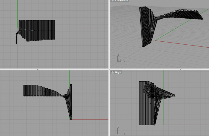
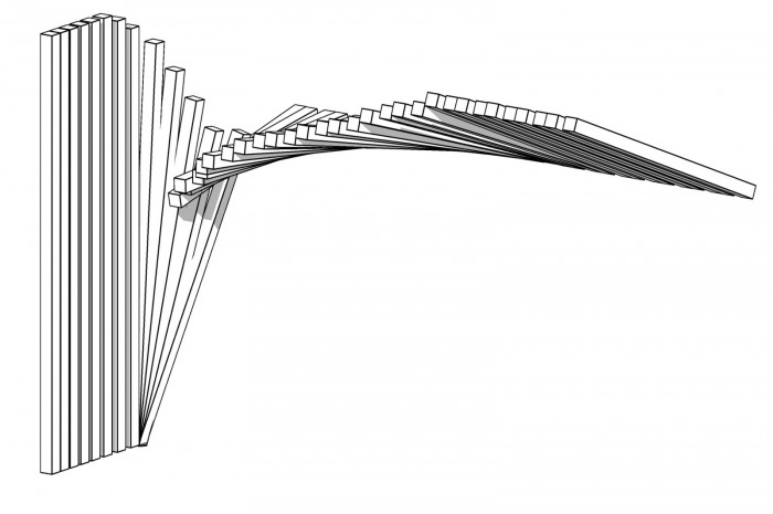
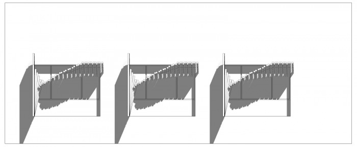
The design of the sun shade was driven from the initial light studies we did two weeks ago. By taking a simple grid structure, I was able to manipulate the form dependent on the filtering of light and foster a sense of movement in a static object. I modeled the sun shade in Rhino which allowed for flexibility in form structure and brought it back into Revit to test the shadow studies. From our discussions as a class, I knew the vertical and horizontal elements were needed to block the western sun. I wanted this shade to read as one dynamic element that transformed across the single window. The first two images are of the 3D model in Rhino and the rest are of the combined models in Revit. By setting the location to Portland, OR and setting the sun to late afternoon in August, I was able to test the worst indoor conditions of the office space. The designed shade covers most of the widow area in this realm of testing, but I was not able to model fully in Ecotect to calculate the thermal analysis. I am hoping with more practice, I will be able to learn the complexities of the program; I think it will be a great tool for further studies.
I was interested in manipulating light in simple ways in order to understand the changes that were taking place. I wanted to see how a simple structure could be manipulated slightly to contrast the regulatory with the unexpected; I kept the variables to a minimum by creating a grid structure and using all white materials. From there, I played with the aperture size, the connection points, the scale and eventually the internal transformation of the grid.
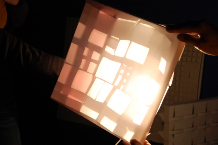
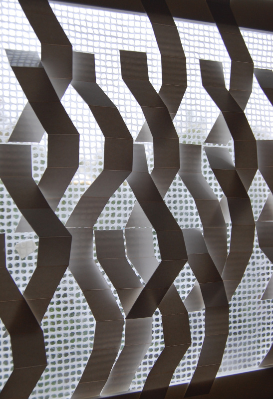
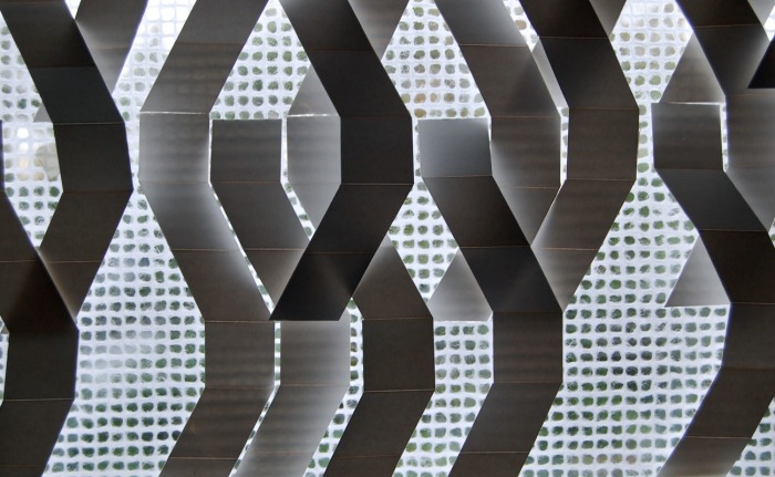
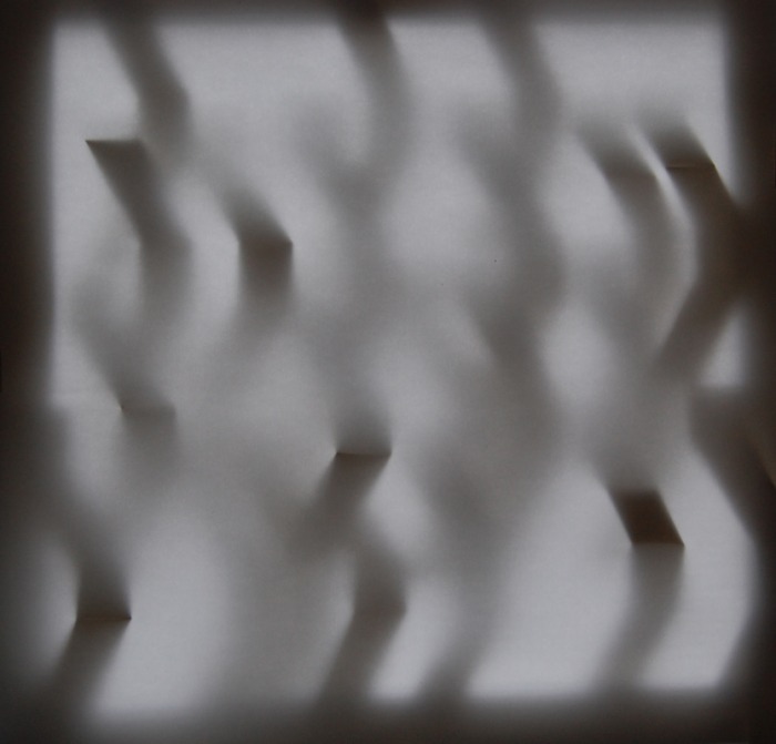
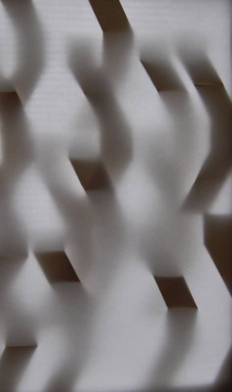
The first test involved white paper and a 2” x 2” grid structure. I created a smaller system within the larger structure. The material choice of plain paper and tape gave the grid a flexible quality creating organic voids between the grid form. By placing a translucent sheet on top of this structure, the shadows were manifested in a variety of ways related to the changes in aperture.
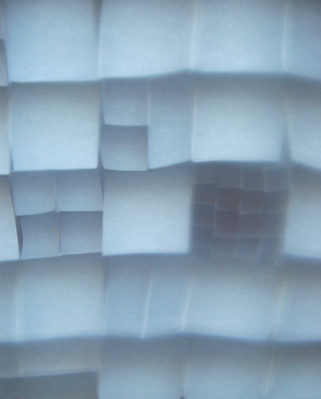
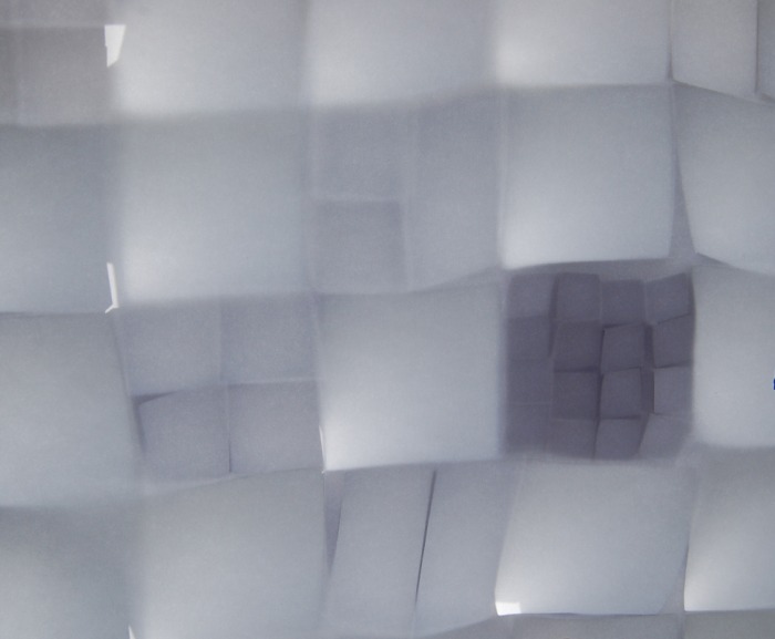
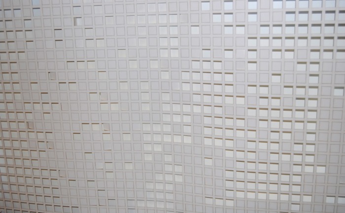
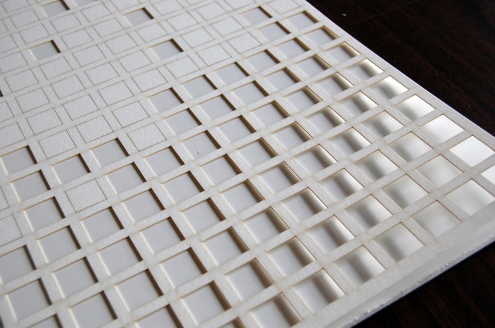
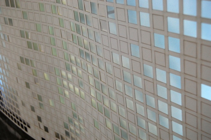
The second screen was a simple iteration of the first. I was interested in keeping the uniform grid structure, but manifesting it at a larger scale. I kept this as a 2-D panel, but again analyzed the aperture size. The random pattern of closed, partially open and open was designed to foster movement across the panel. By manipulating the panel’s planar quality, the patterns created from the shadows help to emphasize movement.
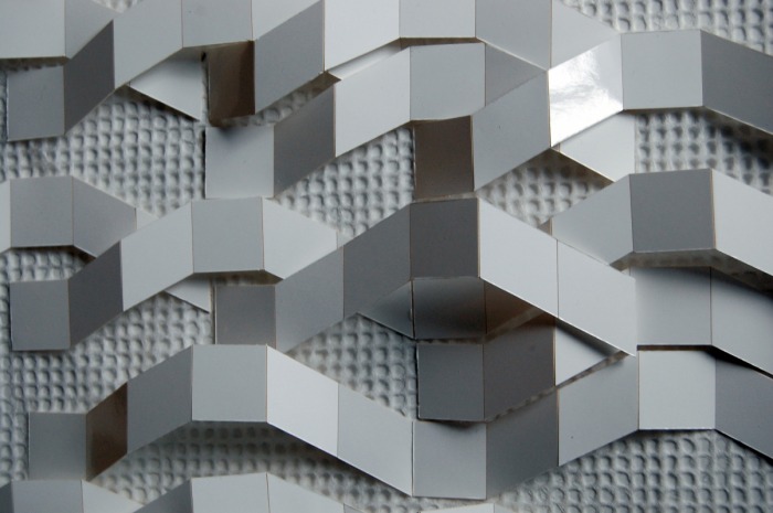
The final panel I used the grid structure as an underlay. From there, I transformed the grid into a simple pattern to see how the geometric form could become more organic through repetition. This pattern was also created one white paper, but with an added glossy finish. The tonal value of the transformed grid was a clear and beautiful way to read the effect of light. The contrast was most evident in the natural light when a translucent panel was added as the final layer and the first two grid formations cast a more elusive pattern.
http://www.mcescher.com/
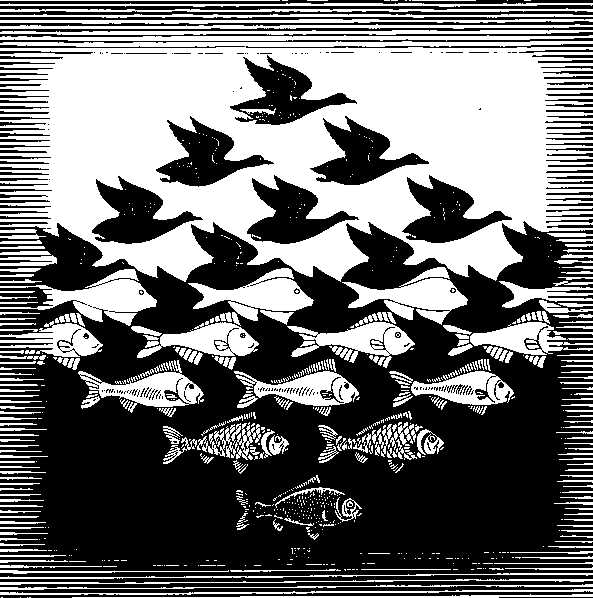
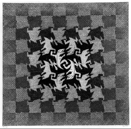
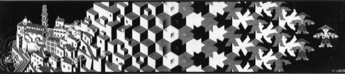
The transformation of Escher's work and the simple composition of figure ground creates intricate patterns that reveal an entirely new composition within a painting. The repetition of a single figure creates voids that in turn become their own figure. This rhythm is continued as one object becomes another and so on. These paintings and the clean use of white and black are inspiring to me as I try to understand the inherent patterns created from light and shadow. The paintings, while two dimensional, foster a sense of movement and carry the viewer’s eyes in more than one direction across the canvas. The moving geometry and pattern is an avenue I’d like to pursue in designing the light panels.
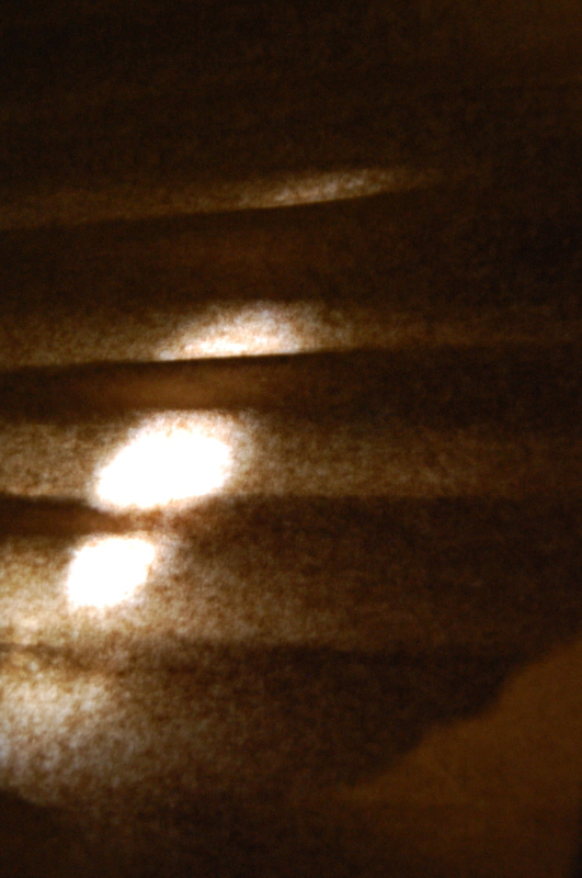
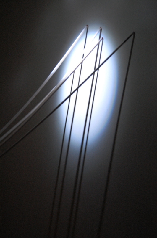
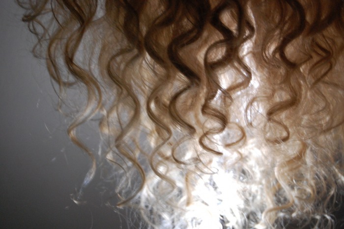
We kicked off the quarter by playing in dark. Using various found materials and different light sources, we were able to capture some intriguing shadows and patterns.


 RSS Feed